
 Login
Login
Visual semantics: The missing piece of topical authority

SEO has long focused on what a page says. Increasingly, it also needs to account for how that information is presented.
As Google gets better at understanding page layout, structure, and functionality, visual semantics is becoming an important part of how search engines interpret webpages.
What is visual semantics?
Visual semantics is a meaning model for segmenting, classifying, and understanding documents by working alongside textual semantics.
Google is changing how it interprets web documents, shifting from “web text” to “web layout” to better identify real expertise, uniqueness, and originality by giving more weight to the functional components of a webpage.
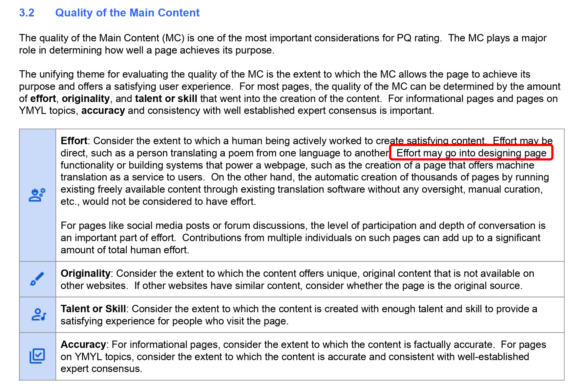
Google’s Quality Rater Guidelines cite “human effort and involvement” as one of the most important quality principles, with “design effort” identified as one aspect of that evaluation.
Webpage layout has always been an important part of SEO, dating back to Google’s Page Layout algorithms. Those early algorithms focused primarily on ad placement and simple document-ranking signals, unlike today’s more sophisticated approaches to understanding webpages.
Track, grow, and measure your visibility across Google, AI search, social, local, and every channel that influences buying decisions.
Why Google is paying more attention to page layout
Google has introduced newer inventions and patents that highlight the importance of understanding webpage layout. Most webpages are no longer built with only prose or simple text-over-text layouts. Instead, they contain much denser information.
Every 10 to 20 pixels can introduce a new interaction point, engagement element, clickable module, comparison unit, or dynamic component designed to help users.
That’s why some of Google’s leading engineers, including those who have worked on Gemini and AI Mode, are also associated with newer inventions such as Structured Information Cards and layout-aware multimodal document understanding.
Below is a direct citation from Google’s work on structured information cards and layout-aware multimodal document understanding. Google often finds important information within interactive card structures rather than ordinary paragraphs.
As a result, it needs systems that can understand how different card types are structured, including product cards, hotel cards, real estate cards, trip cards, credit card cards, and other information cards.
In other words, modern search engines must understand not only the text on a page but also the layout, hierarchy, visual relationships, annotations, and functional meaning of each structured information block.

Why layout matters for search engines
Understanding structured information cards and layout-aware document interpretation requires neural networks, and possibly a new type of LLM, that can “verbalize” web documents with annotations and high-confidence citations.
Google can’t reliably rank a flight booking website, a credit card application aggregator, or similar platforms without understanding the data embedded in these documents.
Much of that data is presented through uniquely designed card structures, comparison modules, tables, and interactive layouts rather than plain text.
Below is an early example of document layout understanding from Microsoft called ViPS, which Google has also cited.

Later, Google patented an alternative approach based on HTML-heavy segmentation.

Both approaches are closely related and rely heavily on HTML to determine which text belongs to each section, component, entity, or visual block on a page.
With the rise of embedding-based algorithms, concepts such as “chunking” have become widely discussed in the SEO industry.
However, many discussions about text or document chunking miss a critical point: Chunking isn’t only a linguistic process. It’s also a layout-aware and structure-aware process.
If a document isn’t visually segmented and structurally understandable to search engines, the content itself becomes harder to interpret. In that case, it doesn’t matter how many entities, predicates, triples, or entity relationships you include, or how accurate they are.
Search engines still need to understand where each piece of information belongs, how it relates to the surrounding elements, and which visual or functional component gives it meaning.
Dig deeper: Image SEO for multimodal AI
How centerpiece annotation affects rankings
In modern search, information quality alone isn’t enough. Information also needs to be presented within a layout that helps machines understand its boundaries, hierarchy, context, and purpose.
Google explained this concept through “centerpiece annotation,” describing visual annotations that help its systems better understand a document.

Martin Splitt from Google said the “centerpiece annotation” represents the “primary content” of a webpage.
Later, documents disclosed during Google’s antitrust case showed that centerpiece annotation was also used to classify and rank news documents.
The centerpiece annotation was primarily limited to about 400 characters, though those documents also reveal several other noteworthy details.
For example, below you can see how Google extracts the centerpiece annotation from HTML. The sentence is interrupted by unnecessary HTML elements, such as Facebook, email, Twitter (X), and Google+ share buttons.

In the next example from Google’s DOJ documents, proper HTML structure prevents share-button boilerplate from interrupting the centerpiece annotation, allowing Google to extract the content correctly.

What visual semantics looks like in practice
Below is a simple SEO case study. Although it involved 19 changes, the biggest ranking improvement came from one simple adjustment: moving a calculator component from the bottom of the page to the top, making it the centerpiece annotation.

The results of that change are shown below.
| Metric | Previous | Current | Increase / Change | Success % |
| Total clicks | 3.47 million | 4.53 million | +1.06 million clicks | +30.5% |
| Total impressions | 84.1 million | 167 million | +82.9M impressions | +98.6% |
| Average CTR | 4.1% | 2.7% | -1.4 percentage points | -34.1% |
| Average position | 8.9 | 8.5 | Improved by 0.4 positions | +4.5% improvement |
This project closely connects visual semantics and textual semantics because it’s a programmatic SEO case study involving more than 100,000 pages.
At that scale, even a small sentence edit, component update, or layout adjustment is multiplied across every URL. That’s why Google re-crawled the entire website after the layout changes and why impressions and clicks increased afterward.
The project is a converter website that ranks for queries such as “2m to cm” and millions of similar numeric and metric variations. In this type of search environment, more than 10,000 competing websites provide essentially the same data and the same answer.
These websites have the same topical coverage and factual accuracy. The competitive advantage doesn’t come from providing a better answer because “1 meter to cm” has the same value everywhere.
It comes from retrieval cost, document understanding efficiency, internal PageRank distribution, and how clearly the answer is presented for Google’s initial ranking systems.

In these types of queries, you can’t differentiate yourself by changing the answer. You differentiate yourself by changing how the answer is structured, annotated, prioritized, and visually presented.
That’s why changing the centerpiece annotation caused Google to reprocess the layout, rerank the pages, and further improve the site’s rankings.
Dig deeper: How to make products machine-readable for multimodal AI search
What is the cost of retrieval, and how does it relate to visual semantics?
“The cost of ranking a document” can’t be higher than the “cost of not ranking a document.” I introduced this concept years ago in one of my conference presentations. Google cares about search quality, but its systems also weigh quality against cost. If a website costs more to process than its quality justifies, Google will look for an alternative.
Google reduced the HTML file size limit to 2 MB and carried out large-scale deindexing following the December 2025 core update.
At the same time, it sent a clear signal to websites that scale AI-generated content without meaningful human effort. Google appears less tolerant of practices it accepted for years, and its indexing decisions are likely to become even more selective.
Retrieval costs increase when a webpage doesn’t clearly explain itself or fails to demonstrate sufficient relevance and responsiveness, especially around the “centerpiece annotation.” Google’s Content Warehouse API leak suggests the company truncates documents and predicts quality based on initial signals. If a document doesn’t meet relevance and responsiveness thresholds during those early evaluations, it won’t be considered a candidate.

During Google’s antitrust trial, Pandu Nayak, then Google’s vice president of Search, explained that Google doesn’t run its most computationally expensive algorithms on every webpage because it lacks sufficient click data. Instead, it first evaluates core topicality signals to determine whether a page is worth indexing and keeping as a candidate.
Nayak also explained that RankBrain-like algorithms are expensive to run, so Google reserves them for results that have at least one click, demonstrate strong topicality, and include annotations that justify the investment in crawling, rendering, evaluation, and further processing.

In other words, classifying documents by their layout, components, and structured information cards is a more efficient way to reduce retrieval costs while improving search quality.
Today, most large-scale content publishers rely on AI to generate more text. Far fewer invest in front-end and back-end systems that improve user engagement, interaction, and document understanding.
That distinction increasingly separates low-quality and high-quality sources. Low-quality sources primarily scale text. High-quality sources scale systems, layouts, components, structured information cards, and user interactions that help both users and search engines understand content more efficiently.
Below is Google’s concept of website representation vectors.

Google classifies websites using visual and layout-related embeddings and features to determine whether they resemble expert, apprentice, or amateur sources.

- “For instance, the website classifications may include a first category of websites authored by experts in the knowledge domain (for example, doctors), a second category authored by apprentices (for example, medical students), and a third category authored by laypersons…”
How does Google’s helpful content system relate to visual semantics?
The helpful content system is a classifier that identifies which websites genuinely provide helpful information or meaningful engagement and which only imitate usefulness without fulfilling the searcher’s underlying intent.
Much of the SEO industry’s analysis of the helpful content system has focused on textual features. Early discussions centered on keyword stuffing, gibberish content, or adding “unique information” to improve information gain. However, many of the system’s algorithms appear to focus on the function and type of a source.
Google first classifies websites by their type rather than their content quality. That means the same content can rank differently on an affiliate website than it does on an ecommerce website.
So how does Google distinguish among affiliate sites, aggregators, service providers, ecommerce sites, and SaaS platforms? The answer is visual semantics. What a page can do, or can’t do, is largely determined by its layout and page components.
The biggest distinction between relevance and responsiveness comes from engagement, not understanding.

Google created systems such as neural matching to align the entity type and entity ID in a query with the most relevant documents. In simple terms, if the entity in the query doesn’t match the entity in the document, that page becomes less likely to rank. This is primarily about relevance.

Relevance alone isn’t enough. A document may rank because it’s relevant, but if it doesn’t support meaningful user actions, such as purchasing, comparing, ordering, reviewing, filtering, or watching, it isn’t responsive to the user’s actual task.
That’s why the helpful content system shouldn’t be viewed only as a system that evaluates page text. It also evaluates page function. A helpful page isn’t simply one that contains relevant words. It’s one that helps users complete the action, decision, or information-seeking task behind the query.

Google reinforced this idea by adding “misleading functionality” to its spam policies after the Helpful Content updates. A page can appear helpful by imitating a function without actually providing it.
For example, a page may suggest users can compare, filter, calculate, book, review, or purchase something even though those functions don’t genuinely exist. In those cases, the page may appear functional to both users and algorithms, but it isn’t truly responsive to the user’s task.
Google doesn’t classify websites only by page layout and design. It also appears to apply result-type constraints within the SERP. For example, a query such as “best women’s glasses” may return listicles, ecommerce category pages, product grids, videos, and commercial guides in the same results page.
To satisfy multiple search intents, Google can apply diversity constraints that limit how many ecommerce pages, listicles, videos, or other result types appear together.
Google’s DOJ documents include functions such as “max_total” and “BlogCategorizer,” which show how Twiddlers can classify results and limit the number of pages from the same cluster, category, or source type.
A similar annotation appears in the Google Content Warehouse API leak through the “WebrefFatcatCategory” module, which assigns categorical weight to a result.
In other words, Google doesn’t simply rank documents individually. It also classifies, clusters, and constrains results based on page type, source category, and categorical diversity. As a result, a page may be relevant enough to rank but still be limited by the overall composition of the SERP.

Even when a generated ranked entity list, such as a “best products” page, ranks successfully, it doesn’t rank simply because it’s a blog article. It ranks because it functions as a commercial resource. It helps users compare, evaluate, filter, review, and move closer to a decision. In that sense, Google can rank nonfunctional content when it effectively serves a functional category.
Viewed through this lens, “helpful” in the context of the helpful content system is closely aligned with “functional.”
The following case study demonstrates this principle. We moved identical content from an affiliate website to an ecommerce website, supported it with an integrated topical map, and saw rankings improve almost immediately.

How is click data used to rerank search results through visual semantics?
Google increasingly understands the purpose of a webpage through its layout, not just its text. As a result, click data is aggregated according to the type of source. Many SEOs assume that long clicks, or longer dwell times, signal quality.
However, that’s not always true, according to Google’s research. Depending on the category, shorter dwell times can indicate a successful experience, while longer sessions may signal an “engagement trap.”

Below is Google’s reranking model, which applies different ranking and rank-modification models based on user behavior captured by its tracking components.

Another example comes from Google’s “Merging Search Engine Results” patent, alongside the “Twiddler’s anatomy” diagram revealed in the DOJ documents.

Google also uses the concept of the “Life of a Click” to help engineers understand how search ranking algorithms interpret user behavior.

Taken together, these systems suggest that click data becomes a more meaningful classification signal when interpreted alongside a webpage’s design rather than through text alone.
Classifying documents by their visual structure can be more efficient than analyzing millions of documents, billions of word tokens, co-occurrences, named entity resolutions, attribute extractions, and value corrections.
If certain document layouts consistently generate stronger user satisfaction, Google can classify those pages as more helpful or functional. It can then use those signals to identify other documents with similar layout patterns, component structures, and interaction models.
This means topical authority doesn’t come only from a topical map that defines which topics to cover. It also comes from understanding which page layouts, component structures, information cards, comparison modules, and functional designs best match each topic, query, and search activity.
A proper topical map shouldn’t define only entities, attributes, predicates, and contextual relationships. It should also define the page type and functional layout needed to satisfy both relevance and responsiveness.
This leads to the concepts of coverage and domain-level classification. The following three examples illustrate this approach.
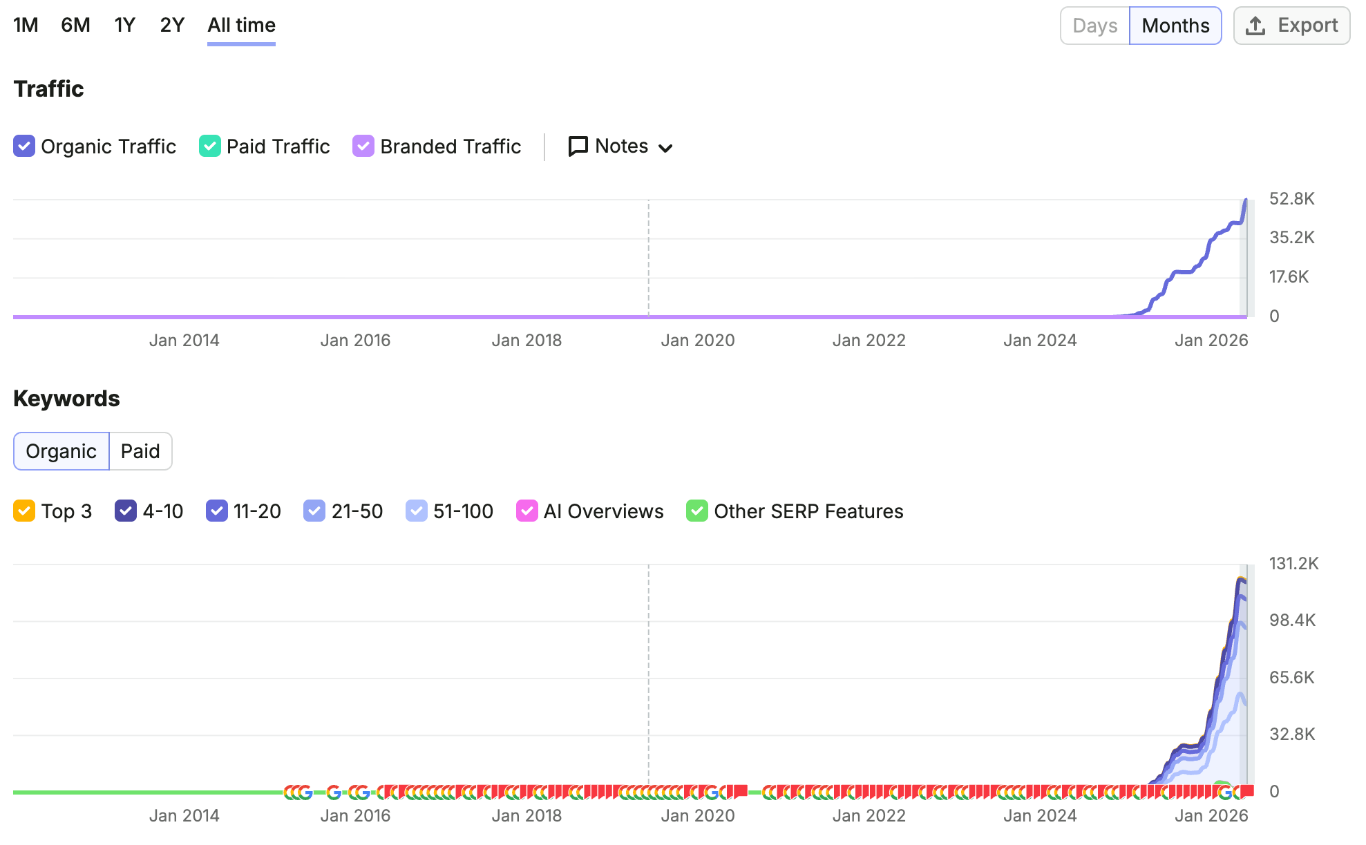
The first example is AudioToText.com, a sub-brand built around a single topic.

GSC Metrics of Audiototext.com. The third-party Semrush data is shown below.

Despite covering only one topic across 12 languages, or 13 pages in total, the site continues to grow in search visibility for three reasons:
- Its exact-match domain reinforces relevance.
- Its visual semantics improve responsiveness.
- It earns its first clicks quickly, allowing Google to run more computationally expensive ranking systems sooner.
Click satisfaction from the other language versions may also reinforce the English version through cross-lingual information retrieval.
Google can use webpage layout understanding and chain-of-reasoning to classify AudioToText.com as a “no-signup transcription tool” and rank it in AI Overviews. This suggests Google isn’t only reading the text. It’s also interpreting the page’s function, visual annotations, and interaction model.
In other words, Google can use agentic retrieval based on visual signals to understand what a page does and determine whether it deserves to rank for a specific query.

The Audiototext.com’s single-page topical map representation with the fundamentals are below.

The webpage was designed with minimal text while placing its primary conversion element, the content upload component, above the fold.
If that component were moved lower on the page or made smaller, rankings would likely decline, and text changes alone wouldn’t be enough to recover them.
Another example is attorneys.lexinter.net, which ranks primarily through a subdomain because its core content was moved there together with a filtering engagement component.
The primary domain didn’t meet the required thresholds, but moving the content to a subdomain with additional functional elements produced better results.

The same subdomain testing approach also worked for Pricelisto.com. Although most of the design and content remained the same, we added functions and annotations related to purchasing, comparing, examining, and reviewing.
Those functional additions made the pages behave less like passive content and more like task-completing commercial resources. As a result, the site avoided filters associated with the Helpful Content System.
The improvement didn’t come from changing the text. It came from changing how the document functioned, how users interacted with it, and how clearly Google understood the purpose of each page component.
Search engines try to reduce retrieval costs by avoiding computationally expensive algorithms whenever possible. As a result, domains affected by historical or domain-level signals may not receive a completely fresh evaluation immediately.
Testing on a subdomain can give Google a clearer reason to reprocess documents, reevaluate their layouts, and run more advanced evaluation systems. That makes it easier to determine whether improvements come from new designs, functionality, annotations, or document structures rather than from the historical state of the primary domain.
How is visual semantics related to the future of search?
Google is experimenting with fundamental changes to search results, including replacing the traditional search bar with new interfaces.
One example is its Jan. 29 patent, “AI-generated content page tailored to a specific user.” The patent describes generating a landing page that uses visual segmentation, annotations, and generative AI to satisfy a user’s query.

In other words, Google can use visual semantics not only to rank web documents but also to construct new types of search results.
Dig deeper: Google patent hints it could replace your landing pages with AI versions
Google’s patent work is often complemented by its research. For example, the paper “Neural Design Network: Graphic Layout Generation with Constraints” explores how systems can understand, classify, and even generate webpage layouts to improve search performance.
This suggests that layout isn’t only a design consideration. It can also serve as a retrieval, classification, and ranking signal.

Google’s multimodal document understanding also connects to its latest announcement, Google Embedding 2, which uses generative neural networks to understand and vectorize text, images, videos, audio, and documents.
This matters because different versions of the same web document can be compared through their vector representations. Doing so makes it possible to evaluate how well Google understands layout differences, visual structure, and document-level meaning.
In other words, layout changes aren’t merely visual. They can also produce different vector representations, which may affect how a document is understood, classified, and retrieved.

Below is Google’s example of the neural network process for understanding page layouts. The centerpiece annotation that helps classify a webpage as an ecommerce category page, product page, or SaaS page comes from these types of labeling systems.

In the future, Google could apply these same principles to construct its own landing pages from multiple search results.
The patent shown below also illustrates how Google could adjust SERP features based on an entity’s primary attributes. That suggests search results aren’t simply ranked and displayed. They can also be reorganized, redesigned, and presented as dynamic interfaces based on the entity, query intent, and available document structures.

Centerpiece annotation and query processing
Google classifies and augments queries differently from how people naturally think about them. That means one of the most important parts of creating a topical map is understanding search terms the way Google’s systems do and augmenting them accordingly. This process is called query semantics. Below is an example of query augmentation from ChatGPT.
In this example, we searched for “best search engine optimization information sources,” and GPT expanded the query as follows:
- Best SEO information sources: search engine optimization resources Google research, patents, SEO blogs

If you perform a search in ChatGPT, open the Network tab in Chrome DevTools, filter for XHR requests, and inspect the JSON file associated with the https://chatgpt.com/backend-api/conversation/6a* path. Look for search_model_queries, which shows what the system actually searches for.
Google also has a patent called query augmentation, shown below.

The patent is attributed to engineers, including Krishna Bharat and Anand Shukla. These names are significant because they also appear on patents and systems related to AI Overviews and AI Mode.
For example, the “Search with Stateful Chat” patent includes query augmentation as one of its steps, and its terminology and inventors overlap with this system.

The centerpiece annotation is the primary visual annotation that reflects a webpage’s purpose, function, and context. The context created through the augmented query needs to align with that centerpiece annotation.
The following case study shows how I classified query variations and their contexts across different document types, each with a distinct purpose, function, and visual structure, for a local service directory.

Let’s use “air conditioner” queries as an example. Each query variation should be matched with the appropriate page type, layout, and function.
- Experience queries require a forum-style layout. For a query such as “How do I repair my AC?” the intent is experience-based. A forum structure works best because users expect real problems, answers, troubleshooting paths, and personal experiences. This content can also live on a subdomain to separate experiential content from the main commercial website.
- Local service queries require a directory page. For “Air conditioner installation in [City],” the intent is local and service-oriented. The best page type is a local directory or listing page with providers, service areas, ratings, contact options, and conversion elements.
- Price queries require a hybrid layout. For “air conditioner installation prices,” the intent is both informational and commercial. The page should provide an immediate answer with average prices, cost factors, and price ranges while also presenting local providers, comparisons, and quote-related elements.
- Instructional queries require an informational layout. For “How to install an air conditioner,” the intent is instructional. The page should minimize local service elements and instead focus on a step-by-step guide, required tools, safety considerations, visuals, and practical instructions.
In short, a topical map should define not only which topics to cover but also the appropriate layout, components, and page function for each search activity. The following example shows some of the early results from this project after classifying query augmentation models for different query variations.

If there’s no need for a separate page for the [Local], [Service], [Forum], or [Instructional List] intent, we simply prune it. If other pages are too similar, we merge them.
As a result, the number of pages decreases along with retrieval costs, while PageRank concentration and relevance per document increase. Below are four closely connected components:
- Mock-up design in draw.io.
- Production design in Figma.
- Topical map for different query types.
- Content brief aligned with the Figma and draw.io designs.

Early on, we defined the topical authority formula as:
- Historical data x Topical coverage
Later, we expanded it to:
- Historical data x Topical coverage ÷ Cost of retrieval
Today, I’d extend the formula with one additional factor:
- ((Historical data x Topical coverage) ÷ Cost of retrieval) x Right visual annotations
Even if you have the lowest retrieval cost, the highest topical relevance, the broadest topical coverage, strong accuracy, the longest duration of satisfied click data, and positive historical performance, none of it matters if the centerpiece annotation is wrong or the page isn’t functional.
Google’s ranking system largely functions as a decision tree. If the first decision-making layer rejects a website, the later evaluations, tests, and reranking processes won’t occur.
To maximize your chances of ranking from the start, visual annotations should be optimized just as carefully as the page’s text, images, and links.
Below is a conceptual model of this system.

A website consists of “letters, pixels, and bytes.” Data2Website is the process of turning a dataset that Google’s algorithms favor into a website by combining textual and visual semantics through those letters, pixels, and bytes.
The example above shows how a local law firm benefited from a topical map, semantically optimized content briefs, specific sentence structures, and visual design decisions.
The Semrush results below show the impact on the firm’s local rankings.

We previously applied the same principles to another ecommerce website.
If you examine the screenshots closely, you’ll see that the same principles carry over from an ecommerce design to a local service provider.
For every attribute within an entity-seeking query, such as “best law firm in Houston” or “birth test kit prices,” you can classify those attributes within the query network and organize them according to their importance.
Some attributes require review components, while others require directly commercial components.

Below are two design examples from the sibling websites Morethanpanel.com and StreamingMafia.com. Their above-the-fold and below-the-fold sections are structured similarly, covering different types of user engagement and functionality.
The above-the-fold area is often referred to as the macro-context because it contains the main content. Google’s Quality Rater Guidelines use the concept of main content to emphasize the importance of relevance, accuracy, and completeness in this section.

The below-the-fold area corresponds to what Google’s Quality Rater Guidelines describe as supplementary content, which we refer to as the micro-context. This section typically contains less important attributes and most internal links.

The next example shows the mock-up design and the distribution of factual content, opinionated content, structured content, and unstructured content.

Google doesn’t always prioritize factual or opinionated content, or structured versus unstructured content. Instead, it evaluates these characteristics based on how the search query is augmented. To improve language relevance, we distribute different types and formats of content using different visualization, verbalization, commercialization, and contextualization techniques.
The following example applies the same approach to the second website in the same industry, together with its topical map, content briefs, and authorship rules.

Algorithmic authorship can be explained through the research paper “Are LLMs Reliable Rankers?” It means writing content according to predefined sentence structures and rules. For example, the research shows that the “Rank anything first” framework increased rankings by 20% to 60%.

The system evaluates which words should follow one another to determine how relevance changes. It performs retrieval within a generative retrieval system and identifies the entity-attribute-value triples that best improve relevance. In the example above, “material” is selected as the attribute and “steel” as the value because they strengthen relevance within that context.
- Factual content: Supports expertise-focused queries.
- Opinionated content: Supports experience-focused queries.
- Structured content: Supports attributes such as symptoms, advantages, and benefits.
- Unstructured content: Supports concepts such as definitions, processes, and importance.
- Visualization: Presents content using the appropriate semantic attributes.
- Commercialization: Adds functional components that help users complete their tasks.
- Contextualization: Maintains relevance by aligning content with the query.
- Verbalization: Converts visually important information into text that LLMs and search engine crawlers can understand.
Depending on the query, Google may prefer opinionated and unstructured content, factual and structured content, or other combinations supported by different visualization, commercialization, contextualization, and verbalization techniques.
The following example from the online dating industry shows how different webpage components can improve relevance and responsiveness at the same time.
The next examples illustrate different ways to visualize content.
Comparing these two sections, you’ll see that one answer is highly factual, while the other, distinguished by a different background color, is more conversational and opinion-based.

We can create a Q&A component and add opinion-based content as forum-style discussions at the bottom of the page.

We can also ask users questions and let them contribute answers through voting, allowing those responses to be verbalized into content that is continuously updated.

Below is what we call the preceding question component. It reframes the original question using a semantically similar concept and gradually shifts the content from factual to more opinion-based.

The next example shows a horizontal tab component that distributes internal links to related headings, increasing contextual coverage.

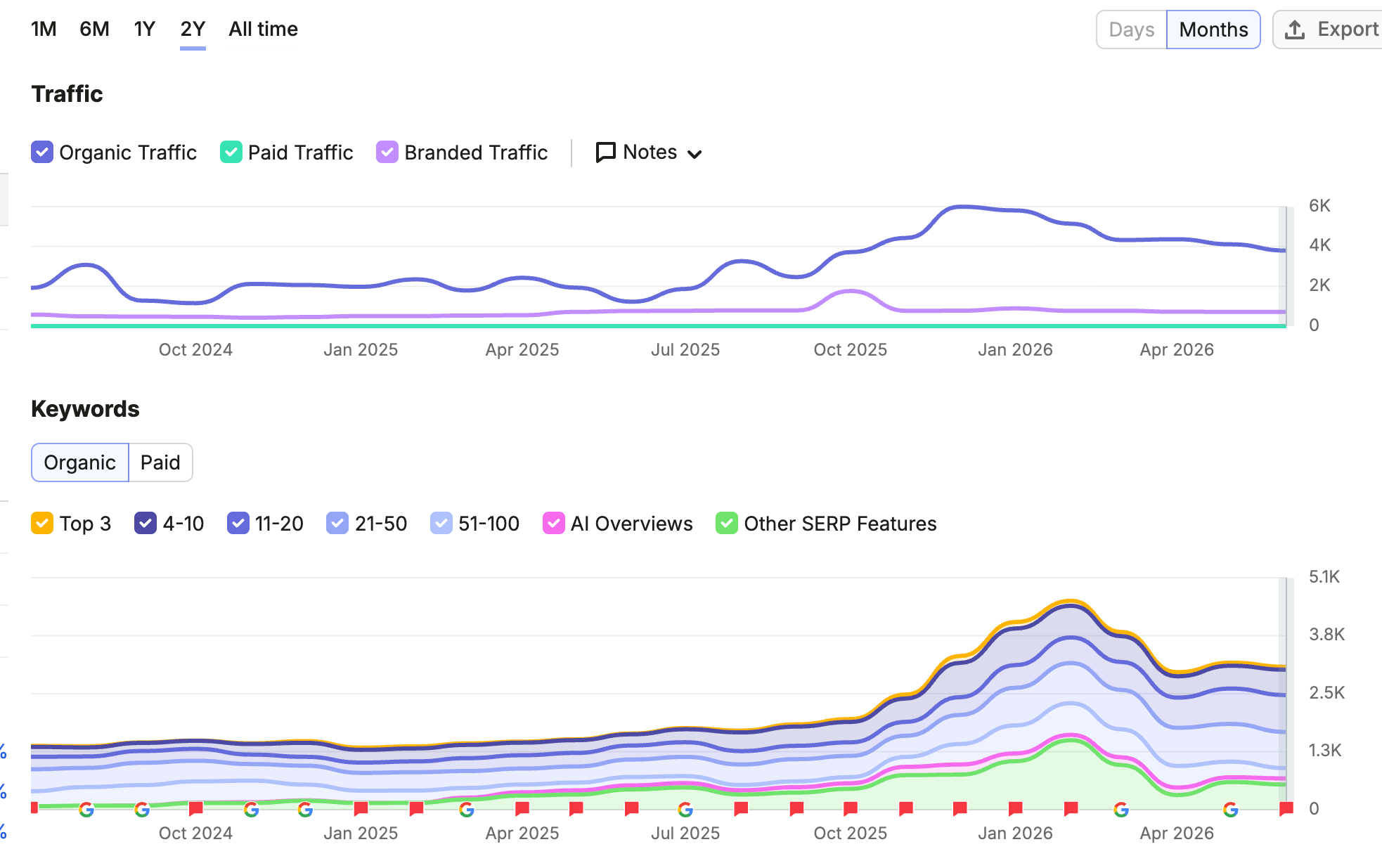
The following Semrush data shows the early and later results for the URLs we modified.
The patents and research behind visual semantics
At this point, we’ve introduced the key concepts, definitions, and website examples needed to explain visual semantics.
We could explore these examples, processes, and implementation details in much greater depth, but every conceptual discussion begins with understanding where Google is heading.
Many of Google’s advances in query semantics, visual semantics, Gemini, and AI Search are driven by two influential engineers: Dr. Marc Najork and Michael Bendersky. They are among Google’s most frequently cited researchers in recent years and have played major roles in shaping the company’s AI-related direction.

They are also listed as inventors on the Layout-Aware Document Understanding and Structured Information Cards patents.
Another important contributor is Alexander Grushetsky, who identifies himself as the founder of RankLab, Google’s internal end-to-end ranking platform.
He’s worth mentioning because he’s frequently cited alongside Bendersky and Najork in foundational patents and research papers.

Grushetsky also worked with Bendersky and other Google engineers on item-ranking models based on item types, attribute sets, and attribute values. We’ll explore what RankLab represents in more detail another time.
Today’s search engines and large language models increasingly rely on visual semantics as part of their vectorization and embedding-based ranking systems.
Even the original Transformer research described extending these ideas to web documents and their layouts.

Years later, that vision became reality through WebRef, Google’s Web Page Transformer.

WebRef vectorizes webpages using not only their text but also their visual layout, page components, HTML structure, and overall document context.
Whether your rankings depend primarily on external PageRank, branded search demand, or internal signals such as semantics, a page’s visual context still carries ranking weight alongside its textual relevance.
