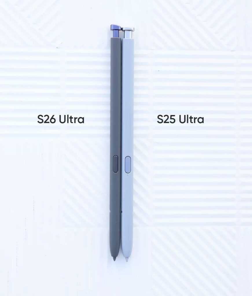
S26 Ultra forced One UI 8.5 to increase taskbar margin
Samsung Galaxy S26, S26 Plus, and S26 Ultra are the first phones to ship with One UI 8.5; among these, the Ultra variant has some extra headspace in the taskbar compared to its predecessor.
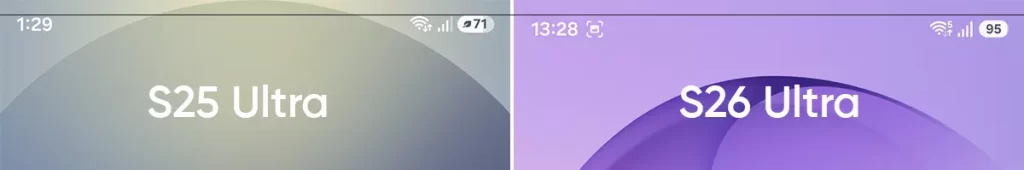
It can be confirmed that the One UI 8.5 has an increased margin from the taskbar icons to the top bezel than the S25 Ultra with the same software version. This difference is quite apparent when you bring the two device closers, and screenshots make this absolute. Check the comparison below (focus on the black horizontal line to measure the margin difference).
This change may be highly influenced by the larger corner radius. Previously, Samsung had sufficient accurate margin on all sides with fewer rounds on the corners, thus supporting the UI to maintain its existing margins. However, that might not be the only reason behind this headspace expansion.
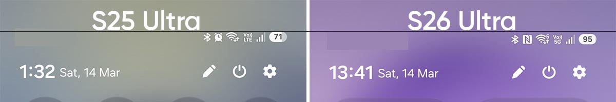
It is speculated that this headspace change could be due to a new selfie camera, which is wider than the S25 Ultra. Furthermore, the front camera hole is larger than the predecessor’s, which is another reason why One UI 8.5 had to adjust the taskbar items to a lower alignment for the Galaxy S26 Ultra.
Besides this new change, the taskbar works as usual, but it might be an indicator that future Galaxy Ultra phones will maintain this taskbar UI margin.
Author’s Take
This is a tiny but noticeable change, and shows the complication in bringing new devices and hardware upgrades. It doesn’t impact the user experience, and first-time users won’t see any major difference, but it’s hard for me to let it slip.
On the other hand, Samsung has already given up on those Note-like corners, and the new design is likely to stay for the next few years. We’ll see what Samsung comes up with the Galaxy S27 Ultra in 2027.
The post S26 Ultra forced One UI 8.5 to increase taskbar margin appeared first on Sammy Fans.