Reading view
Age Check Hits Play Store: You Might Need an ID to Download Some Apps

On app stores like Apple’s and the Google Play Store, there are certain applications that are designed for adults. Now, it looks like Google wants to implement age verification across the board, requiring users to show proof they are 18 or older to download certain “mature” apps from the Play Store.
Google Play Store needs proof of your age
This is according to a post on X by Artem Russakovskii, where he shared screenshots of the age verification system in action. Basically, users need to show Google proof of their age, if not they might not be able to download many apps from the Play Store. This is part of Google’s larger efforts at identifying the ages of their users on search and YouTube.
Based on the screenshots, users have several ways of verifying their age. This comes in the form of uploading a government-issued ID, taking a selfie, using a credit card, or using a third-party service. If you’re already using a credit card in your name to buy from the Play Store, we reckon this shouldn’t be an issue.
At the moment, it is unclear what kind of limitations users might face if they do not verify their age. Presumably, at the very least, they will be blocked from downloading apps designated for adults. However, if the limitations go beyond that, it is going to be very annoying.
Not Google’s fault
Now, you might think that this is just Google’s way of collecting more information on you. That was our first instinct too. However, according to Russakovskii, Google isn’t entirely to blame for this. According to him, Google is just adhering to the law. In the US alone, there are several states that have implemented age verification requirements. This is also true for other countries like the UK.
Google obviously needs to play nice with these states and countries if it wants to keep operating in them. However, for users, these extra steps will be a pain. It would be less of an issue if the process were seamless. But we’ve already seen Google’s reliance on AI has resulted in adults getting banned.


The post Age Check Hits Play Store: You Might Need an ID to Download Some Apps appeared first on Android Headlines.
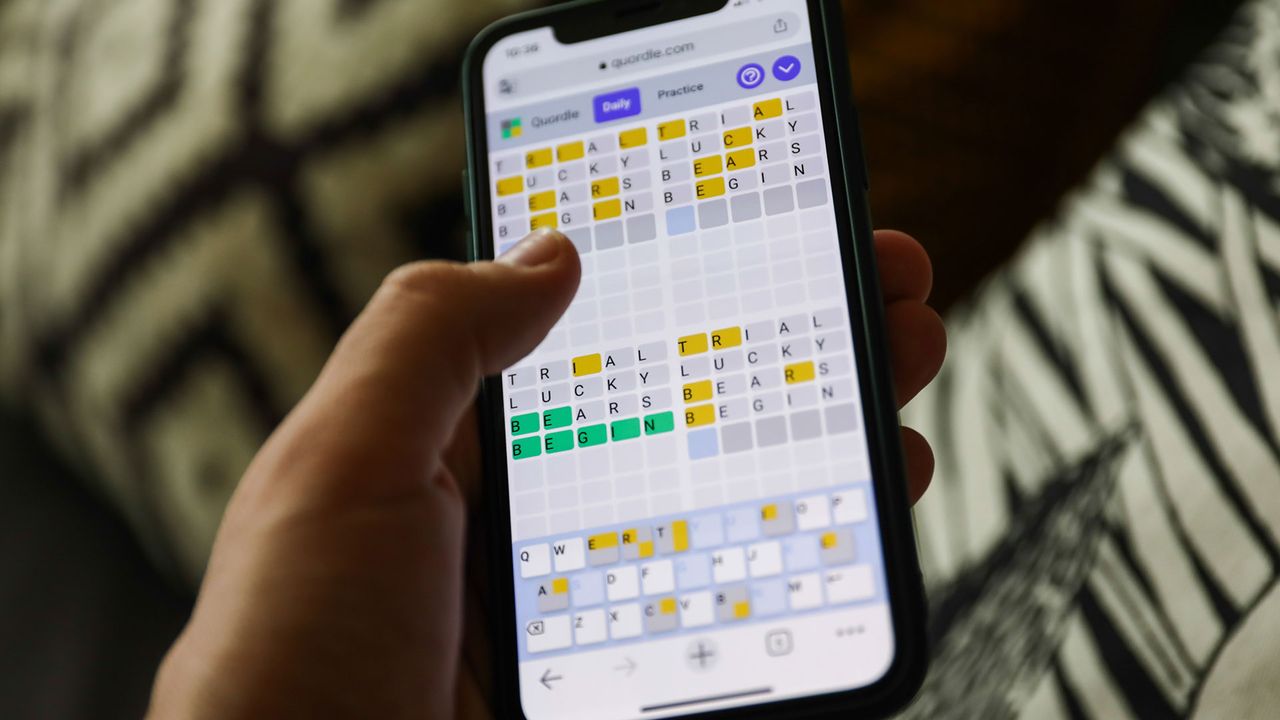
Quordle hints and answers for Wednesday, October 29 (game #1374)
NYT Strands hints and answers for Wednesday, October 29 (game #605)
Mem0 raises $24M from YC, Peak XV and Basis Set to build the memory layer for AI apps
TechCrunch Disrupt 2025: Day 2
Deleted a Text by Mistake? Google Messages Will Soon Let You Undo It

Have you ever deleted an important text in Google Messages and instantly regretted it? Well, you are not alone. Right now, it’s not possible to recover a deleted message. But to address the concern, Google seems to be working on an undo button for its Messages app, making the texting experience safer.
Google is working on an Undo texting button for the Messages app
As reported by Android Authority, a new beta version of Google Messages hints at a new “trash” or “bin” folder. The concept of the new folder is pretty similar to what Gmail already has. When you delete a message, instead of completely disappearing right away, it might move to this trash folder. From there, you could have up to 30 days to recover it before it’s permanently deleted. This change would be a big relief for anyone who’s ever deleted an important text by accident.
Currently, deleting a message on the app is permanent. Once it’s gone, it’s gone for good. There’s literally no way to undo the task or bring back the text. And that’s what makes this upcoming feature so exciting. It finally addresses a problem that’s faced by almost everyone once in their life. Messages are also used for storing important bank texts or transaction SMS, and deleting them by mistake is the fear of many. The new option will finally address this fear.
Google aims for smarter and more reliable messaging services
The latest move confirms Google’s push to make the Messages app smarter and reliable. The app already lets users archive chats they want to hide without deleting them. But archiving isn’t enough when you want to bring back something you’ve completely removed. A new trash folder or undo delete option finally bridges that gap. It gives users better control over their texting experience. It solves a real problem faced by millions of users daily.
The post Deleted a Text by Mistake? Google Messages Will Soon Let You Undo It appeared first on Android Headlines.
Google Messages testing Recycle Bin, a staple in Samsung phones
Google Messages will soon integrate a “Trash” folder, an idea inspired by Samsung’s Recycle Bin feature.
Galaxy phones prioritize Google Messages, instead of Samsung Messages, to offer modern chat features like RCS. However, Google’s native messaging app is still evolving, and Samsung is playing a key role, indeed indirectly.
Google Messages app’s latest Beta shows signs of an upcoming Recycle Bin-like “Trash” feature. It will help users recover deleted chats, just like Gmail. The app will keep deleted chats stored in a separate memory for 30 days.
Samsung Messages has the same feature as the Recycle Bin. When you delete a chat, it goes right to the Recycle Bin, a dedicated folder. You have 30 days to restore the deleted chat; otherwise, it will be permanently wiped out.
Google Messages prioritizes the term “Trash Folder” for this feature, similar to Files by Google. Leaked code snippets suggest the “Trash Folder” will be put on the task to store recoverable “Trashed Conversations.”
All in all, Samsung users are going to benefit much from this feature. It will effectively safeguard messages and prevent the loss of accidental removals.
While Samsung Messages has had it for years, Google’s version is in early stages. The current development is limited to code snippets, and we could see a preview of this feature in the next Beta builds of the application.
Let’s see when Google Messages begins the rollout of its trash folder.

Recycle Bin feature in Samsung Messages
The post Google Messages testing Recycle Bin, a staple in Samsung phones appeared first on Sammy Fans.
Zoom CEO Eric Yuan says AI will shorten our workweek
Threads Gets 'Ghost Posts' That Vanish After 24 Hours

Meta has been increasingly focused on Threads in the recent past, and it’s visible in how frequently it’s been adding new features to the platform. Early last month, the social media app announced long-form posts. As part of that feature, users can now post up to 10,000 characters in one go. Now, Threads is getting a “disappearing post” feature, which Meta calls “ghost posts.” Meta started testing this feature back in April, alongside other features that are now available on Threads.
All the replies to your ghost posts land in your Threads DMs
Threads’ new ghost posts feature enables you to share your thoughts or engage in conversation that vanishes after 24 hours. You’ll be able to create a ghost post on mobile by enabling the toggle that has the new “ghost” icon on the app’s compose screen. The feature is a handy addition for anyone who likes to post something but doesn’t want it to appear on their Threads profile.
Every time you publish a ghost post on Threads, others will see it having a dotted bubble around. This gives an idea to others that it’s a disappearing post. What’s interesting is that the replies on such posts land directly into your DMs and don’t appear on your timeline.
Another thing to note is that other Threads users can’t see the number of likes, replies, or the names of ghost post viewers. However, they can still see smiley-face icons below the disappearing posts. This gives an idea to people that others have replied to or liked the posts.


You can still revisit the post from the “archived” section
Not to forget, you can still check ghost posts from the “archived” section of the Threads’ settings menu. Think of this feature as Instagram Stories that are only available for 24 hours. Meta, in the announcement post, notes that this feature is for those who want to “share unfiltered thoughts and fresh takes without the pressure of permanence or polish. Here today and gone tomorrow, you can feel confident trying new things and posting spontaneous thoughts.”
The post Threads Gets 'Ghost Posts' That Vanish After 24 Hours appeared first on Android Headlines.
Amazon reportedly plans to cut around 30,000 corporate jobs
Fitbit’s revamped app, with Gemini-powered health coach, rolls out to Premium users
Fitbit's Personal Health Coach enters an early preview this week

Earlier this year, Google announced that a Fitbit Personal Health Coach was coming to eligible devices, such as the Pixel Watch 4, and this week, it’s entering an early preview phase. This brings it one step closer to being fully launched, although it will take a little more time to get there, Google admits. This early preview will serve as a way for users to test the new feature and give some feedback to Google so that it can improve where things need to be improved. “Building this health coach takes time, rigor, and input to make sure it works well for everyone, which is why we’re starting with a preview and asking for your honest feedback,” Google says.
Since this is a preview, Google is quick to point out that everything it has mentioned as part of the preview is “by no means a comprehensive list of everything it can do.” That means users can expect it to do even more than what Google has announced so far. Which, by the way, includes everything from creating workouts on the fly to understanding more about specific health conditions. These don’t even have to be health conditions you have. It can just be something you’re particularly interested in learning more about.


The Fitbit Health Coach early preview begins October 28
Good news for anyone who wants to try this out: you’ll be able to give the Personal Health Coach a try starting tomorrow, October 28. Google doesn’t mention a specific time, so you may just have to end up keeping an eye on the Fitbit apps on your devices.
Google says you will need an eligible device to check it out, and this includes Pixel Watch and Fitbit devices. You also need to be a Fitbit Premium subscriber, as this will be a Fitbit Premium feature. Once the feature begins rolling out, users will be able to spend about 5 to 10 minutes having a conversation with their AI-powered fitness coach to get the ball rolling. Doing this isn’t mandatory to begin using the preview, as Google notes you can come back to it later, but it does seem to be recommended.
It’s also worth noting that this preview doesn’t have access to everything the current version of the Fitbit app has. A lot of features are missing. This includes menstrual health logging and tracking, body temp logging and tracking, social features like friends and leaderboards, and a host of others.
That being said, this is a preview, and Google confirms that users can swap back and forth. So, it isn’t a one way or another kind of situation. You can have both, just not in one app experience yet.
The post Fitbit's Personal Health Coach enters an early preview this week appeared first on Android Headlines.
Apple says US passport digital IDs are coming to Wallet ‘soon’
Threads adds ‘ghost posts’ that disappear after 24 hours
Pinterest experiments with new AI-powered personalized boards
Trump and Xi to Finalize TikTok Deal This Thursday

It looks like we’re one step closer to putting this whole TikTok saga behind us. According to US Treasury Secretary Scott Bessent, US President Donald Trump and China President Xi Jinping are expected to “consummate” the TikTok deal this Thursday.
Trump to close TikTok deal this Thursday
According to Bessent, “We reached one in Madrid, and I believe that as of today, all the details are ironed out, and that will be for the two leaders to consummate that transaction on Thursday in Korea. My remit was to get the Chinese to agree to approve the transaction, and I believe we successfully accomplished that over the past two days.”
Last month, Trump signed an executive order that would see ByteDance sell its TikTok US operations to American-owned companies. Ever since he came into power, Trump had been pushing for China and ByteDance to sell TikTok. This was based on concerns that ByteDance is a Chinese company. The US government was worried that data of US citizens and users would be sent back to China.
Under the Biden administration, TikTok was due to be banned in the US at the start of the year. However, following Trump’s re-election, he extended the deadline of the ban several times. At one point, it looked like we would never hear the end of this whole TikTok saga. But come Thursday, Trump will officially close the TikTok deal and put it to bed once and for all.
What does the future of TikTok look like?
Once the deal has been closed, TikTok’s US operations will come under control of a new board of directors. Oracle will be responsible for security operations. These board of directors are also expected to oversee TikTok’s recommendation algorithm, source code, and also take over duties when it comes to the moderation of content.
Note that this only applies to TikTok in the US. For the rest of the world, your TikTok experience should remain the same. However, we have to wonder if TikTok US could undergo a huge change. TikTok’s algorithm is kind of what gives the platform an edge over competitors like Instagram Reels.
But if US companies and engineers are taking over the algorithm to make their own tweaks, what could this mean for creators based in the country? Could they see a drop in views? We suppose we’ll have to wait and see.
The post Trump and Xi to Finalize TikTok Deal This Thursday appeared first on Android Headlines.
Android's Live Threat Detection is Getting Powerful Updates
Google is working to make its on-device security features more transparent and manageable for users. An analysis of a recent beta version of the Play Protect Service app indicates that the company is adding updates to its Live Threat Detection tool, which uses artificial intelligence models to identify potentially malicious applications on Pixel phones and Android devices in general.
The Live Threat Detection feature fully relies on local, on-device AI. This means all the processing happens entirely on the local hardware. This approach allows for quick threat detection without requiring sending sensitive application data to Google’s cloud servers. The result is a strong layer of user privacy throughout the scanning process. Now, Google is making it friendlier and easier to use.
Live Threat Detection upgrade for Android: See every flagged app in one place
Currently, Android’s Live Threat Detection issues real-time alerts when it detects suspicious app behavior. However, the feature offers limited visibility beyond those initial notifications. Google is now fixing this lack of a central hub. The recent findings (by Android Authority) point to the development of a dedicated new page for the security tool. This upcoming screen is expected to clearly list all applications that the system has flagged as potential threats. Moving the threat information from individual, potentially numerous notifications to a permanent, centralized report is a great move. It improves user control and makes the security status of the device significantly easier to check at a glance.
Additionally, Google is adding a new, specific alert type focused on data harvesting. Code strings reveal a future warning designed to explicitly inform users when an application deemed unsafe is detected monitoring the device’s location or activity. This alert directly addresses a major area of concern for user privacy: applications that covertly harvest sensitive data or track user movement patterns without proper consent.


These changes aim to enhance the usefulness of Android’s security tools. The mainstream public often underestimates security improvements because they often act in the background. However, keeping your personal data safe from potential bad actors is key in today’s tech industry.
The post Android's Live Threat Detection is Getting Powerful Updates appeared first on Android Headlines.
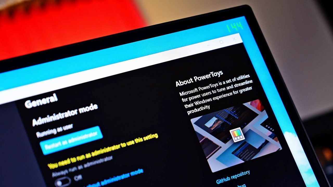
Windows 11’s light/dark mode glitch wasn’t Microsoft’s fault — blame PowerToys (here's why)
Quordle hints and answers for Tuesday, October 28 (game #1373)

NYT Strands hints and answers for Tuesday, October 28 (game #604)

TechCrunch Disrupt 2025: Day 1
Workout app Ladder launches nutrition-tracking experience
Samsung phones get Chrome with complete Expressive UI
Google Chrome browser has now adopted a complete Material 3 Expressive design. The deployment of new UI components was initiated in late August, and Google took almost two months to fully deploy the interface.
Samsung phones have also received the updated Chrome with new Expressive design elements. The leading internet browser app has turned a bit more visually appealing, thanks to Google’s brand-new design language.
Google’s Chrome app has tweaked its 3-dot menu and tab grid.
The 3-dot menu now has forward, bookmark, download, site info, and refresh buttons in circular containers at the top. In the screenshots attached, you can see the Chrome app’s 3-dot overflow menu in Light and Dark modes.

Next is the Tab Grid, which has painted the new tab “plus” icon into dynamic color. Depending on your phone’s theming settings, Chrome’s “plus” key within the Tab Grid will appear be it Blue, Pink, or Monochrome.
When you swipe to close a tab, a pop-up appears at the bottom that has adopted a shadow effect. Tabs in the Incognito mode and Group switcher are also tweaked with the addition of a separate container with a squircle button.

Some components on Samsung phones differ from Google Pixels, probably due to a staged rollout. You may notice even more differences if you’ve a color palette applied, so don’t consider it a bug or deficiency.
Get Chrome 141 to experience the complete Material 3 Expressive design.
Recently, Google has updated the Messages app with a full Material 3 Expressive design; head over here to see what changed.
The post Samsung phones get Chrome with complete Expressive UI appeared first on Sammy Fans.
Ads might be coming to Apple Maps next year
Strava-lawsuit jitters? Discover the feature-rich freedom of Adidas Running

Quordle hints and answers for Monday, October 27 (game #1372)

NYT Strands hints and answers for Monday, October 27 (game #603)

Trump and Xi will ‘consummate’ TikTok deal on Thursday, treasury secretary says
TechCrunch Disrupt 2025 begins in less than 24 hours — catch our last ticket deals
TikTok robot star Rizzbot gave me the middle finger
Samsung Internet v29 brings smart tab tools for everyone
Samsung has released a new update for its web browser, Samsung Internet, bringing it to version 29.0.0.59 (v29). The update adds a few useful features that make browsing easier and better organized. These features were first tested in the Samsung Internet Beta app and are now available for everyone using the regular version.
The new feature of the Samsung Internet app is Auto Close Unused Tabs. This feature helps you automatically close tabs that you haven’t used for a while. Many people keep several tabs open and forget about them, which can slow down the browser or make it messy.
With this option, Samsung Internet can close old tabs after a certain time, keeping your tab list clean and improving performance. You can choose how long tabs stay open or turn off the feature if you prefer to close them yourself.

Image via @theonecid
Moreover, this update also adds a new Grid View for Tab Manager. This new design shows your open tabs as small boxes or previews, making it easy to find and switch between them. The layout looks cleaner and helps you manage multiple tabs without confusion.
These updates were already available for beta users, and now Samsung is bringing them to everyone. The new version shows that Samsung continues to focus on improving user experience and keeping its browser fast, simple, and reliable.
Samsung Internet v29 update is rolling out gradually through the Galaxy Store >> Menu option >> Updates. Download it now and enjoy new features.
The post Samsung Internet v29 brings smart tab tools for everyone appeared first on Sammy Fans.
Quordle hints and answers for Sunday, October 26 (game #1371)

NYT Strands hints and answers for Sunday, October 26 (game #602)

Android's Calling Cards Will Finally Get Full Customization
Google brought visual call customization to Android with the “Calling Cards” feature. However, one key piece of functionality has been notably missing. Android users could design unique screens for their contacts’ incoming calls, but they could not control what their own call screen looked like on a friend’s device. This omission was a significant one compared to rival operating systems. However, Google is now ready to address this long-standing oversight in Android‘s implementation with a new “My calling card” option.
Code spotted by Android Authority within a recent beta version of the Phone by Google app reveals work on an upcoming setting called “My calling card.” The description associated with this unreleased tool is straightforward. It will help you to “customize how you’ll appear when making or receiving calls.” While the feature is not yet functional in the public beta, the explicit text confirms that a true two-way customization system is actively in development.
Android Calling Cards could match iOS’ Contact Posters soon
This change would finally bring full creative control to users. It could allow them to define their visual identity on a remote device. The potential move could also bring feature parity in the competitive mobile space. However, it raises one interesting technical consideration: how will the system handle a potential conflict? What happens if the sender uses the “My calling card” feature, but the recipient has already created a custom card for that contact? Google will likely implement a dual-option system, perhaps giving the recipient the choice between displaying the card designed by the sender or the one they created themselves. This level of user control is necessary for a fluid experience.
There is no official timeline for the public rollout yet. But the discovery of the “My calling card” setting is a clear signal that Google is refining Android’s Calling Cards experience. Once this functionality arrives, Android users will finally gain the full creative control over their call identity.

The post Android's Calling Cards Will Finally Get Full Customization appeared first on Android Headlines.
The Future of Web3 UX: How Simplifying Blockchain Can Bring Mass Adoption
The internet is changing fast. What started as simple web pages has now become a world full of digital ownership, smart contracts, and crypto payments. This is the third generation of the internet, which is referred to as Web3. But there is one big problem. It is not easy to use.
There is a large number of individuals who wish to use blockchain applications, to them halted due to their lack of knowledge regarding how wallets, gas charges, and private keys function. It is even frightening to connect a wallet or authorize a purchase. That is why user experience, or UX, is so significant in Web3.
To put it in simple terms, UX refers to the ease or the difficulty of using a product. Poor UX causes users to abandon them, and good UX causes users to come back. Web3 UX is in the infancy stage, and everything is a bit complex. It must be simplified to access more users, like regular applications like Google Pay or Instagram.
In order to become something that people can bring into daily life, blockchain should become invisible. The user is not supposed to be aware that he or she is using it. The system should work smoothly in the background, and that is where the future of Web3 UX is heading.
What Makes Web3 Hard to Use Right Now
Even though Web3 is full of new ideas, it has one major weakness. It is still made for tech people, not for everyone. Many users find it too complex to even start.
There are three big reasons that make Web3 hard for most people today.
Complicated Wallet Systems
A crypto wallet is needed for almost every Web3 app. But for new users, setting it up can be confusing. There are seed phrases, passwords, private keys, and backup rules. One small mistake can make someone lose all their funds forever. In regular apps, people can reset their passwords easily. But in blockchain, once it’s gone, it’s gone.
This fear makes many people stop before even starting. A better UX will have to remove this fear by offering safe, easy recovery and clear steps.
Gas Fees and Transaction Confusion
Every blockchain transaction needs gas fees. These are small payments made to confirm the transaction. But users don’t always understand what gas is or why the price keeps changing. On busy days, the fees can go up suddenly, and that makes people angry or confused.
Future Web3 UX will need to make this automatic. The system should pick the right gas fee and show a simple message like “Your transaction will complete in 10 seconds.” That is how easy it should feel.
Lack of Clear Design and Instructions
Most Web3 sites are still built for developers. They often use tech words like “bridge,” “staking,” or “hash” that make no sense to regular users. Simple design, clear buttons, and easy words are what the next phase of Web3 UX needs.
Why Simplifying Blockchain UX Is Key for Mass Adoption
Blockchain will not go mainstream unless it becomes easy enough for anyone to use. Most people don’t want to think about how something works inside. They just want to use it and get results.
Simplifying Web3 UX means hiding the complicated parts and showing only what’s needed. When people can open an app, buy something, and sign a transaction without fear or confusion, that is when blockchain will really grow.
Better UX also means trust. When users feel safe and confident, they spend more time in the ecosystem. They explore NFTs, DeFi, and games. They bring friends too. That is how mass adoption starts. Here is an example of what before and after UX improvement can look like:
| Action | Before UX | After Simplified UX |
| Send crypto | Enter address manually | Choose contact name |
| Pay gas fees | Set manually | Auto-calculated in app |
| Sign transactions | Use long wallet popups | One-tap confirmation |
| View balance | Check explorer | Visible inside the app |
| Manage keys | Manual backups | Cloud + social recovery |
This table shows how simplification can make blockchain act more like normal apps. Small improvements like these can change everything for new users.
Once blockchain tools become simpler, more people will join. It is the same story as the early internet. At first, only developers used it. Then came browsers and search engines. The same will happen with Web3. When the UX becomes smooth, adoption will follow.
Major Projects and Platforms Leading UX Innovation in Web3
Some projects already understand how big UX is for the future. They are trying to fix problems and make blockchain easier to use for everyone.
MetaMask and Wallet Simplification
MetaMask used to feel complex for many new users, but over time, it improved. It added features like one-click token swaps, easy network switching, and now even mobile login. The app also shows warnings for risky websites, which helps protect beginners.
Coinbase and Easy Onboarding
Coinbase is known for making crypto easier for normal users. It hides complex actions behind simple buttons like “Buy,” “Send,” or “Receive.” The app also connects directly to Web3 dApps through its wallet extension, which removes many confusing steps.
Arbitrum, Polygon, and Low-Fee Layers
Another big improvement comes from networks like Arbitrum and Polygon. They help cut gas fees and make transactions faster. For users, this means cheaper actions and fewer failed transactions. That alone improves the overall experience.
Here’s a small table comparing some popular Web3 wallets and their UX features.
| Wallet Name | Speed | Design Simplicity | Recovery Option | Cross-Chain Support |
| MetaMask | Medium | Good | Seed phrase only | Yes |
| Coinbase Wallet | Fast | Very Easy | Cloud backup | Yes |
| Trust Wallet | Fast | Simple | Recovery phrase | Yes |
| Rainbow Wallet | Medium | Modern UI | Social login | Partial |
| Phantom (Solana) | Very Fast | Excellent | Recovery via seed | No |
This comparison shows that wallets are slowly moving toward simplicity. Future ones will likely combine the best of all: one-click recovery, low fees, and clean designs.
Role of AI and Automation in Web3 UX
Artificial intelligence is starting to play a big role in Web3 design. It helps remove small confusions and guide users better. AI can make blockchain easier in many ways, like automating gas fee selection, predicting user intent, and helping with lost keys.
Chat-Style Wallet Assistants
Some wallets now use chatbots that talk with the user. Instead of clicking through complex menus, users can just type what they want. For example, “Send 10 USDC to Alex,” and the AI assistant prepares the transaction.
Smart Transaction Tools
AI can also predict network congestion and suggest the best time to make a transaction. It can calculate the best fee for the fastest confirmation. This not only saves money but also makes blockchain use feel smooth and intelligent.
| AI Feature | Benefit to Users | Example in Web3 |
| Auto gas calculation | No manual setup | MetaMask AI plugin |
| Transaction prediction | Faster approvals | Arbitrum AI integration |
| Voice or chat commands | Easier to interact | AI wallet assistants |
| Fraud detection | Safer experience | Coinbase security AI |
AI takes away guesswork. It turns a complex blockchain task into something anyone can do without fear. This mix of AI and UX is the next big step for Web3 apps.
How Cross-Chain UX Makes Blockchain Feel Unified
One of the biggest issues in Web3 is how many blockchains exist. Ethereum, Solana, BNB Chain, Avalanche, and so many more. Each one works differently and uses its own tokens. For normal people, this can be confusing. They don’t understand why they can’t move coins easily from one to another.
Cross-chain UX is trying to fix this. It means building apps that work across different blockchains in a single interface. When users can do everything from one place, blockchain starts to feel like one connected internet, not a group of small islands.
Single Interface for Multiple Chains
A big trend now is multi-chain wallets. These wallets let users send or receive tokens on many blockchains without leaving the app. For example, Trust Wallet and OKX Wallet support dozens of networks on one screen. Users can switch between chains like Ethereum or BSC without even knowing what’s happening under the hood.
This kind of experience hides the complexity and makes blockchain feel like a normal digital app.
Importance of Unified User Flow
Cross-chain UX makes things smoother for developers and users both. It means people can buy an NFT on Polygon and then use it in a game built on Arbitrum. No need to worry about bridges or manual transfers. That’s what future apps will look like: simple, connected, and user-friendly.
| UX Feature | Old Way | New Cross-Chain UX |
| Token transfers | Bridge manually between chains | Done inside wallet |
| App access | One app per blockchain | One app for all chains |
| Fees | Pay in each network token | Unified gas token system |
| NFT use | Locked to one chain | Shared between multiple chains |
Cross-chain UX is what will make blockchain feel complete. It removes the feeling of walls between chains and helps new users see Web3 as one whole ecosystem.
UX Design Trends Shaping the Future of Web3 Apps
UX design in blockchain is not just about color or buttons. It’s about making something hard feel natural. The way users interact with wallets, tokens, and dApps is changing fast. Some design trends are now leading the next wave of Web3 UX.
Gasless Transactions
Some platforms now pay the gas fee for users or let them pay it in stablecoins. This removes a big confusion. Users don’t need to know about ETH or MATIC tokens to make transactions. It feels more like using an app that just works.
Human-Readable Wallet Names
Instead of long wallet addresses, some projects now let users use simple names like “john.eth” or “sara.crypto.” These are called ENS (Ethereum Name Service) domains. It makes sending tokens easier and safer because no one has to copy long codes.
Social Recovery Instead of Private Keys
Losing a seed phrase used to mean losing everything. Now, wallets are adding social recovery. It means friends or trusted contacts can help restore access if someone forgets their password. This feels more like normal internet apps.
| Trend | What It Fixes | How It Helps Users |
| Gasless payments | Removes gas confusion | Makes sending faster |
| Simple wallet names | Long codes are hard | Easier to share |
| Social recovery | Seed phrase loss | Safer access |
| Mobile-first design | Desktop-only use | Brings blockchain to phones |
These design trends show that Web3 is learning from Web2. The goal is to make blockchain tools work for everyone, not just developers.
Challenges Developers Face While Simplifying Web3 UX
Although UX is improving, developers continue to struggle a lot in their attempt to make Web3 easy. Blockchain is not just a normal database, and that complicates things.
One of them is the challenge of simplicity and decentralization. Developers would like to simplify things, but they also wish to have the users in control. One such example is to make apps centralized by adding password recovery. Then they have to strike a compromise.
Slow onboarding is another issue. Upon registration, new users must create wallets, keys, network connectivity, and even purchase crypto first. That’s a lot for a beginner. Making this process easier without violating the blockchain regulations is time and testing.
Scalability and Performance
Some apps become slow when the network is busy. That also hurts UX. Developers must design systems that stay fast even with millions of users.
| Developer Problem | Why It’s Hard | Example |
| Balancing control | Easy UX vs user ownership | Custodial vs non-custodial wallets |
| Complex onboarding | Too many steps for new users | Wallet setup confusion |
| Network limits | High gas and lag | Ethereum congestion |
| Security trade-offs | Simpler UX can mean risk | Auto-sign features |
These problems show why Web3 UX is not easy to fix overnight. But step by step, it’s getting better with new ideas and community testing.
Conclusion
The future of Web3 depends on how easy it becomes to use. If people can use blockchain without stress or fear, it will spread faster than ever. Simplicity is not just about good design; it’s about trust. When apps are clear, users trust them more.
Blockchain started as a tech project, but it will become part of normal internet life through better UX. AI, automation, and multi-chain support are already showing that direction. One day, people won’t even say they are using blockchain; they will just use it. That’s when Web3 truly becomes mainstream.
Frequently Asked Questions About UX and Web3
What does UX mean in Web3?
The abbreviation of user experience is UX. In Web3, it refers to the ease or the complexity of using a blockchain application. With a decent UX, users should be able to buy, send, or trade crypto without worrying or having to understand technical aspects.
Why is Web3 UX more complex than normal apps?
Web3 applications are more difficult as they require distinguishing such aspects as keys, wallets, and gases payments that are not regularly encountered by ordinary users. All these are concealed behind some casually placed buttons in normal apps, but Web3 still displays too much technical data in the first place.
How can better UX help blockchain adoption?
Once Web3 apps are easy and approachable, they will be used more by people. The UX should be smooth as this creates a feeling of trust and confidence so that users can navigate crypto without fear. It transforms blockchain into one of the baffling technologies into something that anybody can use in everyday life.
What are examples of simple Web3 apps today?
Coinbase Wallet, Trust Wallet, and Rainbow Wallet are some of the already-improving wallets. They are designed with intuitive designs, quick logins, and simple recoveries. Such minor additions allow amateurs to get into Web3 without being confused and intimidated.
Will AI make Web3 easier to use?
Yes, AI can make blockchain apps much simpler. It can explain what transactions mean, help pick gas fees, warn about risky websites, and even recover lost accounts. With AI guidance, Web3 apps will feel smarter and more user-friendly for everyone.
Glossary
Web3
The next generation of the internet that runs on blockchain technology. It allows users to own their data, use crypto, and interact directly with decentralized apps instead of big companies controlling everything.
UX (User Experience)
How a person feels when using a product or app. In Web3, it means how easy or hard it is to use wallets, trade crypto, or understand smart contracts.
Blockchain
A digital system that records information in a secure and transparent way. It stores data across many computers so no one person or company can control it.
Wallet
A digital tool used to store and send cryptocurrencies. It can be a mobile app, browser extension, or hardware device that helps people manage their blockchain assets.
Gas Fee
A small payment made to blockchain validators who confirm and record transactions. It is like a service charge for using the blockchain network.
Summary
The future of Web3 depends on how simple it becomes to use. Right now, many people stay away from blockchain because it feels too technical. Complicated wallet setups, seed phrases, and gas fees confuse users who just want easy tools.
But the new wave of UX improvements is changing this. Developers and designers are focusing on clean interfaces, automatic gas settings, human-readable wallet names, and better onboarding experiences. AI is also stepping in to help people understand what they are doing without getting lost in blockchain terms.
Cross-chain tools are making it possible to move tokens between networks easily, so users no longer feel stuck in one place. This new direction is what will make blockchain as normal as using social media or online banking.
A future Web3 app might let someone buy, trade, or store digital assets without even realizing they are using blockchain. That’s the goal, to make Web3 so smooth and natural that it just works. When that happens, blockchain will finally reach the mainstream world and become a part of daily life.
Read More: The Future of Web3 UX: How Simplifying Blockchain Can Bring Mass Adoption">The Future of Web3 UX: How Simplifying Blockchain Can Bring Mass Adoption


How to use the new ChatGPT app integrations, including Spotify, Figma, Canva, and others
EU Warns TikTok & Meta Could Face Heavy Fines for Transparency Breach

The European Commission has accused TikTok and Meta of breaching the EU’s strict transparency laws under the Digital Services Act (DSA). The authority claims that the two popular social media platforms have made it difficult for researchers to access public data and for users to report illegal content or challenge moderation decisions. Both companies are hereby taken into legal custody.
TikTok and Meta face EU scrutiny for transparency breach
As per the commission’s preliminary review, TikTok and Meta have imposed complicated steps that hinder the researchers from studying how their respective platforms operate. The officials have also argued that such barriers prevent them from analyzing how the platforms are used, especially by minors, and that the users are exposed to harmful and illegal materials.
The DSA, for reference, mandates that the large tech companies must make their data easily accessible to qualified researchers. Both Meta and TikTok have failed to do so. The regulators believe that they may be undermining efforts to keep digital ecosystems accountable. If the commission’s allegations are proven right in the court of law, the companies could face fines worth billions.
Both companies may face an industry-wide ripple effect
Meta has responded to the allegations by claiming that it has already adjusted its systems in line with DSA. New reporting options and data access tools have been added. An official spokesperson stated that the company “disagrees with any suggestion” of a violation and continues discussions with EU officials. Further, TikTok is yet to publicly comment but is expected to submit a formal response soon.
If the commission upholds its findings, the companies could face a penalty of up to 6% of their annual revenue. Several other tech giants, including Apple, have earlier objected to the Digital Services Act. But regardless, they abided by the rule, and the final decision could reshape how these companies handle transparency worldwide.
The post EU Warns TikTok & Meta Could Face Heavy Fines for Transparency Breach appeared first on Android Headlines.
Instagram’s latest feature lets you go back to see your watched Reels
The full breakout session agenda at TechCrunch Disrupt 2025
Amazon's master plan to replace 600,000 workers with robots by 2033 — complete with a "good corporate citizen" play to avoid backlash from the growing divide between the tech elite and normal people

Ticket savings countdown — just 3 days until TechCrunch Disrupt 2025 turns San Francisco into startup city
Strava Drops Lawsuit Against Garmin Amid Fears of Damaging Key Partnership

Strava and Garmin used to be thick as thieves. However, in the past month or so, the relationship has soured. Some of you might recall that Strava recently filed a lawsuit against Garmin. But for some reason, Strava has since voluntarily dropped its lawsuit.
Strava drops its lawsuit against Garmin
It is unclear what led to Strava changing its mind. However, according to a report from DC Rainmaker, it speculates that this could be due for several reasons. For starters, the Strava and Garmin lawsuit did not hold much water to begin with.
For those unfamiliar, Strava accused Garmin of patent infringement. In particular, it covered patents related to the segments and heatmaps features. DC Rainmaker believes that suing Garmin over alleged infringement for segments is a risky way for Strava to get its own patents invalidated. That might have been one of the reasons behind Strava’s decision.
Another potential reason is the downside to the lawsuit. As the report points out, most of the risks fall on Strava. It notes that Garmin is the company’s most important partner and biggest source of customer revenue, where Garmin customers were some of Strava’s biggest paid subscribers. Let’s not forget that the data from Garmin helps boost Strava’s platform for routing. This means that if Strava were to really pull its service or if Garmin decides to cut off Strava, it could essentially force Strava to shut down.
Last but not least, Garmin seems to have a pretty good streak when it comes to patent infringement lawsuits. Over the past 10-15 years, Garmin has successfully defended itself against multiple patent infringement claims. The company also boasts a pretty substantial patent library of its own. This means that if Garmin wanted, it could easily file a countersuit against Strava’s 20 or so patents.
Is Strava toast?
Now, we wouldn’t be so quick to say that Strava is doomed. However, it does put the company in a difficult position. Like we said, Garmin’s partnership with Strava is important. Unless Strava can find a way to generate as much revenue with other wearable makers as it did with Garmin, we’re not sure what the company can do.
Garmin also appears to be ready to move on. The company announced new integrations with Komoot, a Strava competitor, in recent weeks. This suggests that Garmin has no interest in working with a company that would sue them. Either way, only time will tell if Strava will be able to survive this fallout.
The post Strava Drops Lawsuit Against Garmin Amid Fears of Damaging Key Partnership appeared first on Android Headlines.
Instagram Debuts New AI Editing Tools to Help You Restyle Your Stories

Meta-owned Instagram has introduced new AI-powered image editing tools, which allow users to restyle their Stories. Previously, Meta’s AI editing tools were only available through the Meta AI chatbot inside Instagram. However, the tech giant has now streamlined the editing process, allowing users to quickly make changes before sharing their stories.
Instagram Stories get a new “Restyle” menu with AI image editing features
Instagram users now don’t have to rely on Meta’s AI chatbot to edit their images or videos. The social networking giant has now built the AI photo editing features right into the new “Restyle” menu in the app. These allow you to reimagine your photos and Instagram Stories by making edits, big or small, using Meta AI.
Now you can remove unwanted details, add playful elements, change the vibe, or start a trend with Add Yours stickers. These features are quite similar to other AI-based image editing tools, as they also allow you to remove unwanted objects from the background of photos or change up your outfit.


Here’s how to access Instagram’s new AI editing tools
You can access the Restyle menu by tapping the paintbrush icon on top of the screen while creating a story. Then, choose Add, Remove, or Change and describe what you want to edit. You can also type your image editing request directly into the text prompt bar.
Furthermore, you can get instant results by selecting from the preset effects above the bar. You can find even more options using the browser icon. Once you generate the new image, tap “Done” to finish before sharing your story. The new Add Yours stickers feature will make it easy for your friends to apply the same edits you used.
To restyle your videos, tap the + on your profile photo and choose a video from your camera roll to add to your story. Then, select the restyle icon from the top tray and pick a preset effect. Once the app generates a new version of your video, just tap “Done” to complete the process and share it to your story.
Instagram has started rolling out the new editing features on its smartphone application. Some of these options, like the new video editing presets, could take some time to reach all users.

The post Instagram Debuts New AI Editing Tools to Help You Restyle Your Stories appeared first on Android Headlines.
YouTube's Major UI Redesign is Now Hitting Android and iOS

Google’s streaming platform, YouTube, is getting a major overhaul. This follows an announcement made last week. The redesign is hitting the app’s menu system and UI icons, including the top and bottom bars. The icons are now bolder and more rounded, helping with the visibility. Among the multiple tweaks, the major redesign comes to the YouTube video player, which is now reportedly rolling out for Android and iOS.
YouTube for Android and iOS gets a major video player redesign
The YouTube video player redesign, as spotted by 9to5Google, features a completely new look, with softer UI elements and almost transparent icons and buttons. This new design doesn’t obscure the content that’s on the screen. But then again, design is always subjective. In portrait orientation, there’s a new icon set. The landscape button is now slightly bigger and is placed in a circle. The new like and dislike buttons get longer thumbs.
Content interactions are getting more personal with custom “Like” button animations. When you like certain videos, there’s now a “custom, dynamic visual treatment” based on the content. For instance, liking a music video will trigger an animated musical note, and sports videos include a visual cue from the game.
The comment section also sees a major change
The video player in landscape has the thumbs up/down, comment, save, share, and overflow placed in a pill-shaped container at the bottom-left corner. On the bottom-right edge, there’s also a cleaner “more videos” button when you pause the video. The background is no longer darkened.
Double-tapping to skip gets a more subtle and compact animation compared to before. This is to be “less intrusive to your video watching experience.” Other changes announced last week include a more seamless transition animation that slides up the feed when moving between tabs. When saving videos to playlists or Watch Later, “a refreshed design simplifies the process.”
The comment section is also seeing a major change, with the new thread design. This makes it easier to follow conversations and replies. The new YouTube video player and icon redesigns are rolling out widely for Android and iOS (version 20.42).


The post YouTube's Major UI Redesign is Now Hitting Android and iOS appeared first on Android Headlines.
OpenAI’s Sora App Is Coming to Android Soon with New Video Tools

Earlier this month, OpenAI released its Sora app for iOS. It turns out it was a hit, surpassing 1 million downloads in under a week, outpacing ChatGPT’s growth. The bad news is that OpenAI did not release Sora for Android, but that’s changing soon.
OpenAI is bringing Sora to Android
In a post on X by Sora head, Bill Peebles, he revealed that OpenAI is bringing the app onto Android soon. The post talks about some of the changes that users can look forward to in future updates. This includes more creation tools, character cameos, and also improving the social experience.
The post also reveals that the app will introduce basic video editing capabilities. We’re talking about basic features like stitching together multiple clips. Then, towards the end of the post, Peebles mentions that the Android version of Sora is “actually coming soon.” However, he did not mention when the app will be available. But it’s good to know that OpenAI has not forgotten about Android users.
This is good news for Android users who have been looking forward to the mobile version of the app. However, do note that at the moment, Sora is still invite-only. It is also only available to ChatGPT Plus and Pro users, meaning paid subscribers. However, when the app is available on Android, you can sign up and be notified when invites become available.
What is Sora?
In case you’re learning about this for the first time, the Sora app is based on OpenAI’s Sora 2 video and audio generation AI model. It is essentially OpenAI’s version of Google’s Veo and Flow platforms. Users can use the app to generate videos with simple prompts. However, one of the standout features comes in the form of Cameos.
Cameos basically allow users to digitally insert themselves into videos. So, if you’re someone that’s a bit camera shy, Cameos are the perfect way to insert yourself in a video without actually being in the video. So far, the examples we’ve seen are pretty impressive and amazing.
At the same time, it raises all kinds of ethical and moral questions. Even before the arrival of Sora, deepfakes were a problem. Now that AI-generated videos have become more convincing, who’s to say that these tools won’t be abused for malicious purposes? OpenAI has considered that and has implemented safeguards.
This includes the use of visible watermarks and industry-standard metadata. This is so that it is clear that the video in question was generated by AI. Will that be enough? We’ll have to wait and see.
The post OpenAI’s Sora App Is Coming to Android Soon with New Video Tools appeared first on Android Headlines.
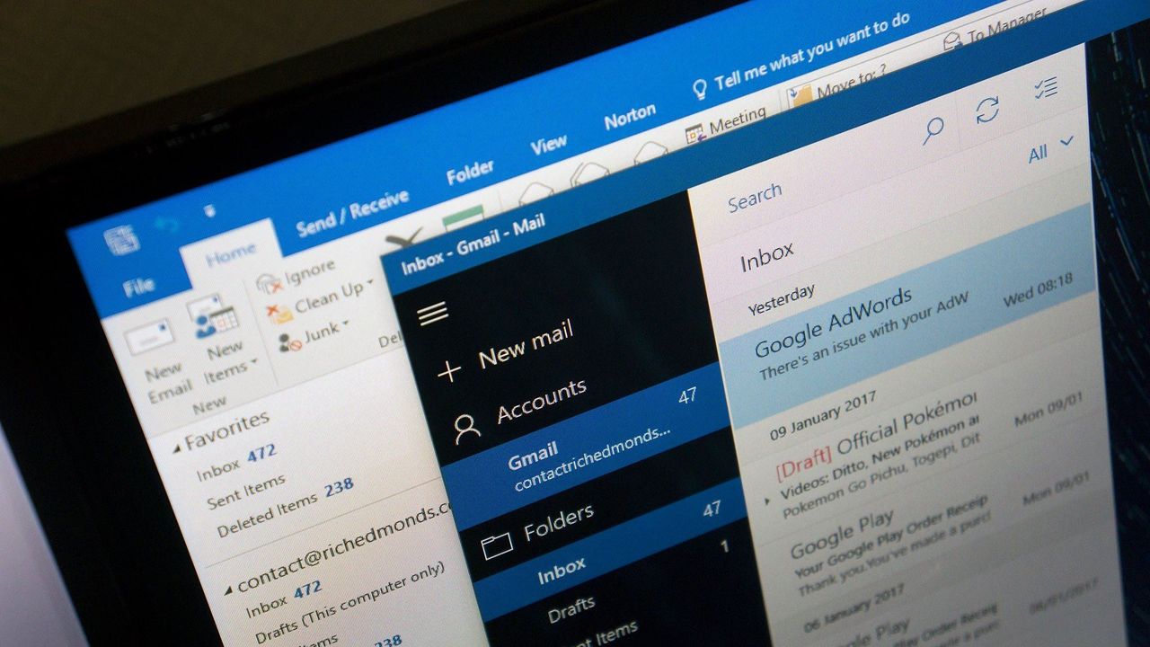
Microsoft fixes bug preventing classic Outlook launch — but still recommends the new Outlook for Windows as a workaround, despite it not being prime-time ready
